September 2026 update: GPT Image 2.5 Flare and Sunburst are now available. See the new model guide and output quality prices for the latest integration. This article covers the earlier GPT Image 2 workflow.
A lot of AI image announcements sound impressive for about five minutes.
The demo looks great. The examples are polished. Everyone posts the same verdict: this changes everything.
Then you actually try to use the model for product work.
That is where things usually fall apart.
An app icon is not just a pretty square image. A logo is not just a cool visual. A favicon is not just a tiny export. They all live inside real constraints: they need to be readable, consistent, adaptable, and ready for production. That is exactly why we wanted to bring GPT-Image-2 into Iconwiz.
If you've been looking for a GPT-Image-2 app icon generator, a GPT-Image-2 logo generator, or a GPT-Image-2 favicon generator, the interesting part is not that the model can make images. Plenty of models can do that. The interesting part is whether the result can survive the trip from prompt to shipping asset.
The Problem With Using a Raw Image Model for Brand Work
Most image models are good at giving you a moment. They are less reliable at giving you a system.
That distinction matters more than it sounds.
When you're exploring a landing page illustration, you can tolerate some ambiguity. When you're creating a product icon, you usually can't. The shape has to stay recognizable at small sizes. The contrast has to hold up on different backgrounds. If you are designing a logo, the mark needs to feel intentional, not merely decorative. If you are making a favicon, every unnecessary detail becomes visual noise.
That is where a lot of AI-generated branding work starts to feel fragile. It looks good in one screenshot and falls apart everywhere else.
We have been testing GPT-Image-2 specifically through that lens. Not "Can it make a nice image?" but "Can it help someone build something that still works once it leaves the generation window?"
Why GPT-Image-2 Feels Different
What stood out to us first was not style. It was control.
GPT-Image-2 is good at following intent when the prompt is really about product positioning. You can ask for something like a calm fintech icon, a sharper developer-tool mark, or a friendlier productivity logo, and it tends to move in the direction you meant instead of giving you a loosely related aesthetic collage.
That makes a real difference for anyone searching for an OpenAI GPT-Image-2 icon generator or GPT-Image-2 for app branding. Most of the time, what they really want is not infinite creativity. They want a model that understands the job.
It also helps that GPT-Image-2 is useful across several adjacent tasks:
- concepting app icons
- exploring startup logos
- generating favicon directions
- editing with references
- tightening an existing brand direction instead of starting over
That range matters. Small teams rarely need one isolated image. They need a family of assets that feel like they belong together.
App Icons Are a Brutal Test
App icons are probably one of the least forgiving formats in modern product design.
They need to work in an App Store listing, on a home screen, in a system settings page, in a notification context, and sometimes at sizes so small that a subtle detail simply disappears. An icon can feel balanced at 1024 by 1024 and still look muddy at 48 by 48.
This is why a GPT-Image-2 app icon generator is only useful if the workflow around it respects those constraints.
What GPT-Image-2 does well is help you get to strong candidates faster:
- cleaner silhouettes
- better visual hierarchy
- stronger central forms
- more readable logo-style compositions
What Iconwiz adds is the part people usually end up doing manually afterward:
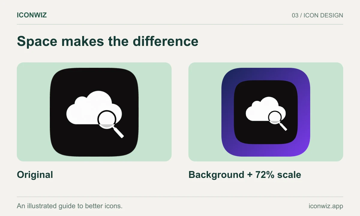
- controlling scale and padding
- choosing square, rounded, circular, or squircle shapes
- adjusting layered backgrounds
- refining shadows and balance
- exporting full icon sets for every platform
That combination is much closer to what product teams actually need than a single-image output.
Logos Are Usually an Iteration Problem
When people search for a GPT-Image-2 logo generator or a GPT-Image-2 AI logo maker, I do not think they are usually asking for one-click final branding.
They are asking for momentum.
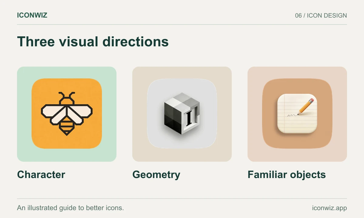
Logo work is often about narrowing the field. You want to see whether the product feels better as a monogram, a symbol, a badge, a wordmark, or some hybrid of all four. You want to test tone. Should the brand feel more technical, more playful, more premium, more direct?
GPT-Image-2 is useful here because it can respond well to structured creative briefs. It is capable of giving you multiple plausible directions without each one feeling like it belongs to a completely different company.
That makes it valuable for:
- early startup branding
- product renames
- side-project identity work
- campaign-specific logo explorations
Not because it replaces a full brand process, but because it speeds up the part where you are staring at a blank page.
Favicons Expose Every Weakness
Favicons are where overdesigned AI outputs go to die.
That sounds harsh, but it is true.
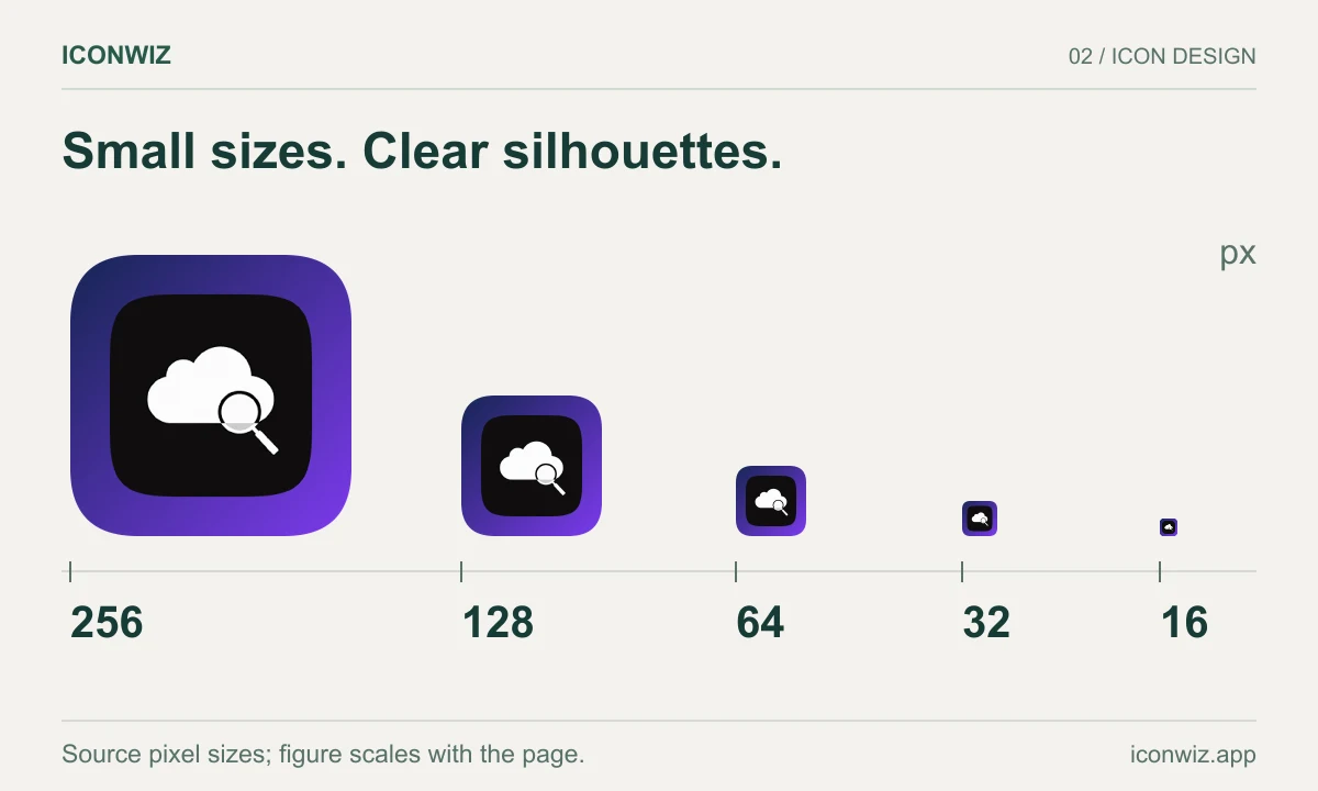
A design with too much internal detail, too many lighting effects, or too much tiny typography can still look impressive in a big preview. Shrink it down and the whole thing collapses. That is why a GPT-Image-2 favicon generator needs restraint more than spectacle.
What we like about GPT-Image-2 for favicon work is that it responds well when you ask for simplicity explicitly. If you prompt for a bold symbol, high contrast, minimal detail, and strong separation between foreground and background, it tends to give you something you can actually work with.
And then the editor takes over:
- simplify the composition further if needed
- add breathing room around the symbol
- make the background more stable
- export the exact favicon sizes you need
That is the difference between "interesting AI art" and something you can confidently put in a browser tab.
Reference-Based Editing Is Where It Becomes Practical
One of the best reasons to use GPT-Image-2 is not generation from scratch. It is reference image editing.
This matters if you already have a brand direction, even a loose one.
Maybe you already have:
- an old icon that needs a refresh
- a rough logo draft
- a website with an established color system
- a mood board from a previous sprint
- a hero graphic whose style you want to preserve
In those situations, starting from zero is often the wrong move. You do not want novelty. You want continuity.
That is why GPT-Image-2 reference image editing is so useful inside Iconwiz. It gives you a way to push an existing direction forward without breaking its identity. For early-stage teams, that is often more valuable than raw imagination. It lets you evolve instead of reset.
Low, Medium, and High Are Not Just Pricing Tiers
We shipped GPT-Image-2 in three practical modes:
- Low
- Medium
- High
That sounds like a pricing detail, but it changes how people work.
Low is good when you are still feeling around for a direction. Medium is the default for a reason: it is usually the best balance of quality, speed, and cost. High is what you reach for when you already know the concept and want to see the cleaner, more finished version.
That progression feels natural in a real design workflow.
You do not need maximum quality on prompt number one. You need speed, feedback, and a clear way to climb toward a final.
What We Actually Wanted to Build
We did not want to add GPT-Image-2 just so we could say we support another model.
We wanted a workflow that answered a more practical question:
What does it look like to use GPT-Image-2 for real product branding work?
For us, the answer looks like this:
- Generate several strong directions quickly.
- Use references if you already have brand context.
- Pick the concept with the clearest silhouette and identity.
- Refine it inside the icon editor.
- Export the final assets for where they actually need to live.
That workflow works for app icons. It works for logos. It works for favicons. It also works for all the in-between assets teams end up needing once a product starts to feel real.
Try GPT-Image-2 in Iconwiz
If you want to create app icons with GPT-Image-2, create logos with GPT-Image-2, or create favicons with GPT-Image-2, the best way to understand the integration is to use it in the actual editor.
Open the editor, choose GPT-Image-2 Low, Medium, or High, and work the way you normally would:
- start from a prompt
- bring in references
- iterate
- refine
- export
The model matters. But the workflow around the model matters more.
That is the part we focused on.
Iconwiz now supports GPT-Image-2 for app icons, logos, favicons, and reference-based edits. Try it in the editor.